The event has ended and it was a success. Participants are fired up with new knowledge. A graphic recorder captured the event (either virtual or in-person) and people loved seeing their ideas and discussion points come to life, or they were inspired by the speaker’s innovative story-telling. They feel connected to the message and want to take action.
Nancy Duarte, author of Resonate: Present Visual Stories That Transform Audiences advises,
After the brilliant thinking in the presentation is solidified, it ripples through and informs other related materials needed to support and spread the idea like web sites, social media, brochures, and so forth… Remember, just because you communicated your idea once doesn’t mean you’re done. It takes several presentations delivered over and over to make an idea become reality.”
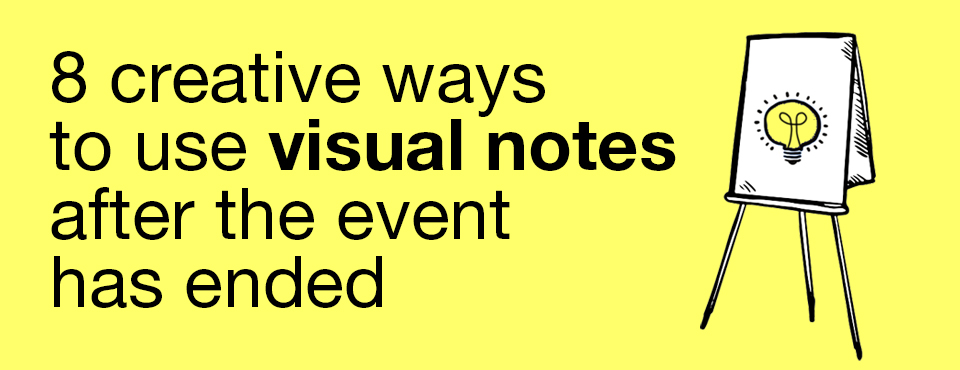
So what are some of those related materials? How can you keep the excitement level up, to continue to build upon the passion that was generated? Here are seven eight ideas of how to use your new visual notes and transform them into connected marketing and learning assets.
1. Whiteboard video
I’ll start with the asset whose potential I’m most excited about – animated whiteboard videos. Viewers love them. I can’t stop watching them (or making them). They’re fun and effective at explaining complex concepts and processes in an easy-to-follow animated story.
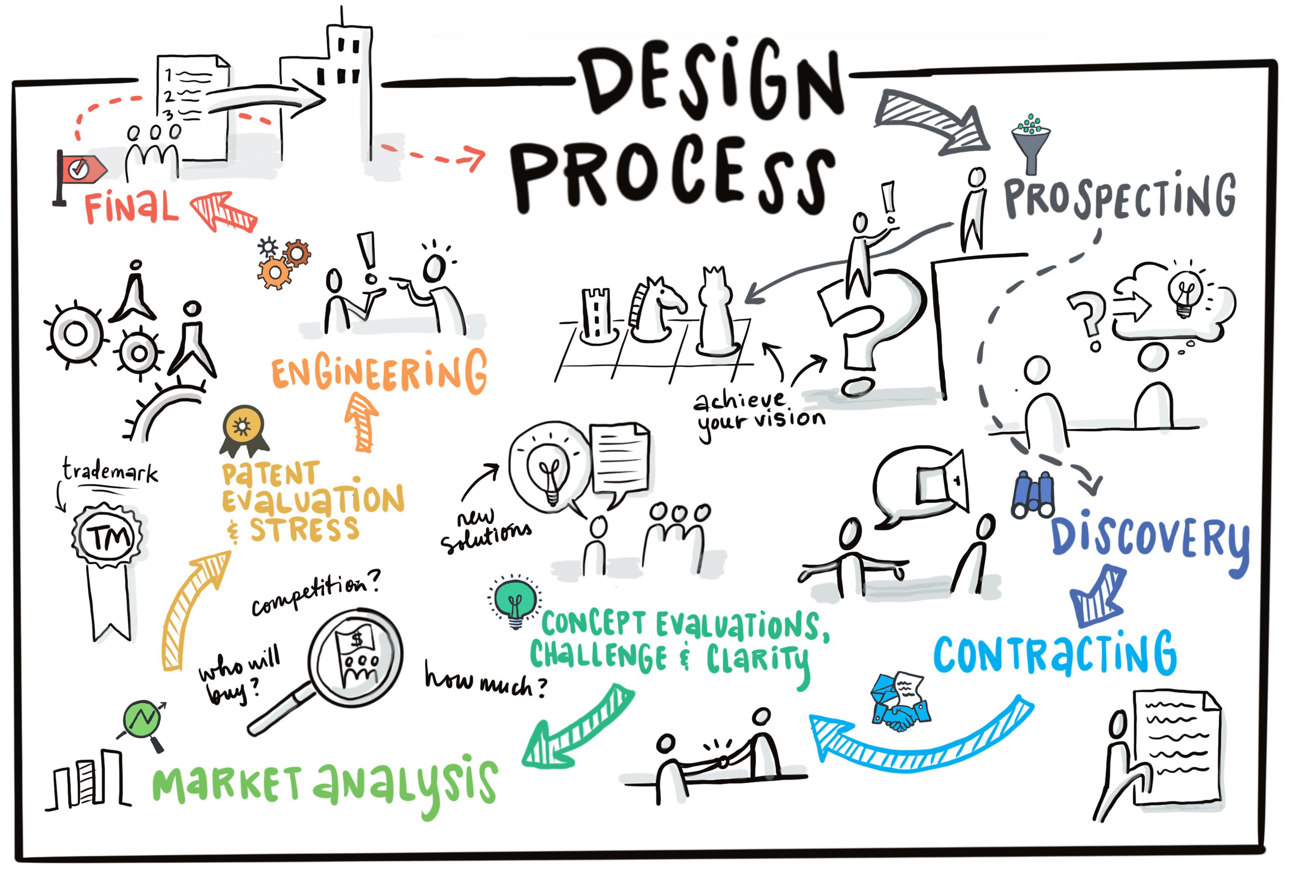
Here’s an example. I took visual elements from a graphic recording I did of an online webinar featuring a trio of experts discussing innovation amidst times of crisis, and reverse engineered the chart. The result is a short, one-minute visual summary of the one-hour event. Now the hosts can easily share this to not only help participants remember the content but also – it will help viewers think of the organization that made it happen, thereby boosting brand recognition and in this case, their thought leadership.
2. Animated presentation
As Nancy Duarte says, presentations need to be given repeatedly in order to “change your world”. But they don’t always need to be given in exactly the same format. Different audiences, different platforms. Here’s an example of an animated story-telling presentation I created with a finished graphic recording from a webinar on virtual fundraising for nonprofits. By zooming in and panning across individual elements, it’s way more effective for presenting and teaching than a series of static slides.
3. Static slides
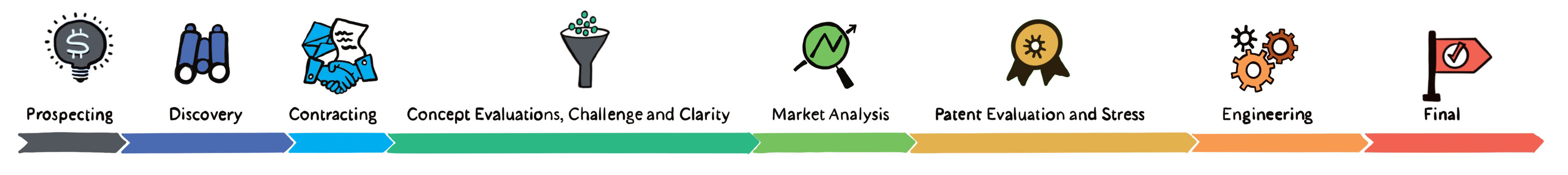
But not to get all down on slides – they still have their role. They just need to be designed with an engaging story in mind that evokes emotion, paired with compelling visuals. What’s more captivating for viewers – a dry slide too full of text and numbers, or a slide with engaging hand-drawn elements? These graphic elements don’t need to be re-created, they can simply be “cut out” vignettes from the chart that has already been drawn and used in a Powerpoint or Keynote presentation.
4. Publications
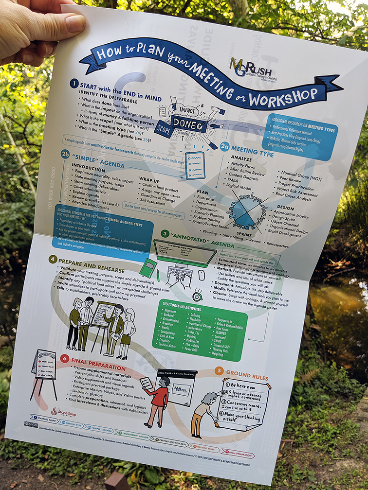
For that matter, the entire chart or elements of it can be included in a publication such as a report, brochure or executive summary.
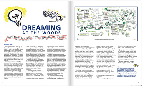
One of our higher education clients used images from our graphic recordings in their alumni magazine in a story about their strategic planning initiatives, where I was brought in to capture the conversation points from several focus group sessions throughout the day.
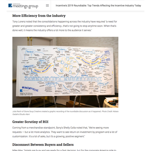
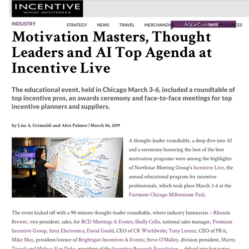
Another client in the incentives industry inserted images of the graphic recording in a couple of online articles recapping their annual conference.
5. Infographic
Are there specific learnings or messages from the event that could be gathered, shared, or discussed with your team? An infographic is a good way to summarize key points using statistics, quotes and icons that are also “cut out” from the finished chart, and maybe re-designed for a new purpose. An infographic can take many shapes. Charts and graphs, a timeline, process map, and customer journey map are all different structures that can be used in follow-up materials that continue to relay knowledge.
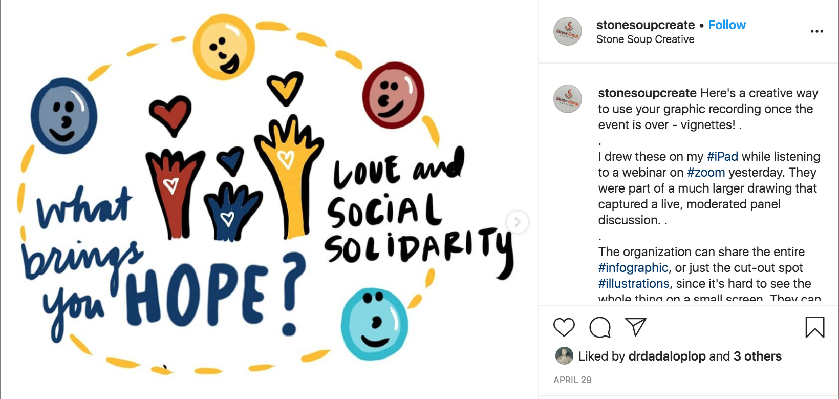
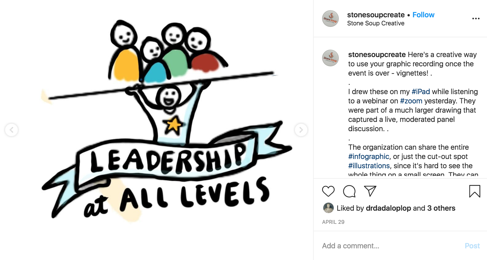
6. Mini-stories
I got this idea from reading Eva-Lotta Lamm’s blog. In a post on her digital sketchnoting process, she says she takes “extracted individual content chunks and exported them as separate images. This is a nice format to create little slideshows that present series of points on one sub-topic in a more guided narrative format” and then follows up with an example image from Instagram (@evalottchen). I’ve never done this for a client (or seen a client do it with a drawing I’ve done), BUT I have done it myself on Instagram (in advance of writing this blog post, while I was still formulating different ideas) which is so good for telling visual stories, like so:
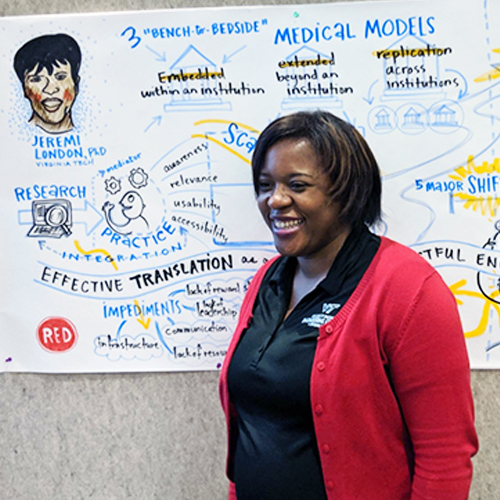
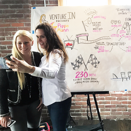
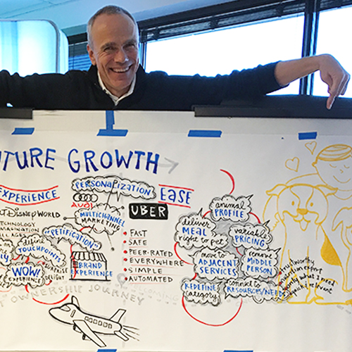
7. Selfies and social media
If it’s an in-person event, give speakers, clients or hosts the opportunity to take selfies with the finished graphic recording (especially if I’ve drawn a headshot of the speaker, which most of them love). I’ve seen audience members eagerly share their excitement on social media – don’t forget a good event or campaign hashtag! – and in a learning or meeting situation, forward pictures of visual notes to friends and colleagues that couldn’t attend.
One of the benefits of doing a virtual event is that the digital drawing is available as soon as the event is over and can be shared immediately (no need for “cleaning up” photographs of drawings back at the studio).
8. Hang it up
I really wish I had a picture to share here! But clients often report back to me that they’ve hung the board or framed a printout of the chart in their office or hallway. They’re proud of the work their team has done and want to display it in a public space.
The higher ed institution I mentioned above said that “once each session had been completed, the sheets were hung up in the hallway of Hulman Hall for all groups to review and compare ideas and dreams of each other.”
For paper charts, I recommend a high-quality scan and print out on an archival surface from a place like Landau Chartworks to make it look brand new.
I’m sure there are MANY other creative ways to use charts after the meeting, event, conference, workshop, webinar or other session has ended. In what ways have you used them, or seen them used? Please share!
Just came across your blog post today. I might admire your efforts for writing this excellent article. Reading such content enriches my current knowledge base. Thank you for that. Well, I will share your article on my social media. Keep sharing.
I love the animated presentation idea, it looks pretty cool!