[Note: this post is an abridged version of a paper I wrote for a Graphic Design History class from November, 2020 while I was pursuing an MFA at Indiana State University. The project topic was to focus on graphic design in the service of social issues by writing a paper and an accompanying Pecha-Kucha-style slideshow about design specific to a social movement. The full 11-page paper can be accessed here, while the slideshow can be viewed below.]
[Another note: I’ve used the term “designer” mostly to refer to graphic designers since that was the focus of the class, but the term could and should be applied more loosely to encompass any individual who is a creative designer of experiences, processes, and products; and include visual practitioners such as graphic recorders / graphic facilitators.
The benefit of expanding social justice knowledge as designers is that the messages communicated become more inclusive. When thinking is inclusive, it enhances creativity and the ability to generate more ideas and better solutions—which in turn activates the ability to be innovative.”1 – AIGA: Diversity & Inclusion: learning basics
We live in tumultuous times for the struggle for justice and racial equity in the U.S. Amidst rampant police brutality against Black people arose the Black Lives Matter movement, which flourished on social media with the ubiquitous hashtag. Scrolling through Instagram, my usual feed of dogs, bikes, food and clothing became increasingly politicized with messaging to make people of color’s voices heard and images seen. White people and other people of privilege like myself were called upon to do the work necessary to educate themselves and not become a contributor to a systemic culture of oppression.
I didn’t know how – it was unfamiliar territory. I felt guilty. I felt fearful of saying and doing the wrong thing.
A few months later I came across an article from The Urban Institute, “Applying Racial Equity Awareness in Data Visualization”2. Urban is a nonprofit research institution in Washington, DC that communicates their mission to “open minds, shape decisions, and offer solutions” to a diversity of audiences using words and data in written reports. They have an internal style standard guide that considers the words and images they use in order to “develop a more diverse, equitable, and inclusive approach to presenting and visualizing data.” I read the paper with interest since it offered specific areas where I – a frequent designer of infographics – along with others, such as researchers and analysts, can be more inclusive in how we present data.
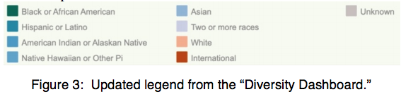
Some of the recommendations were text-based and a few were visual, and it was these latter tips that really resonated for me. “Using colors with a racial equity awareness” means making choices that do not reinforce gender or racial stereotypes – which may seem obvious, but the authors provide an eye-opening, highly nuanced example from a real-life university’s “Diversity Dashboard” where colors assigned to a variety of ethnic groups seem to pit white students against nonwhite students.
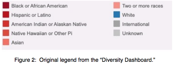
Further, a bright blue color assigned to the white student population “pops” from the page more than the range of gray hues used for others, which fade into the background, subtly communicating the importance of the white students while simultaneously diminishing other populations.
The design field lacks diversity
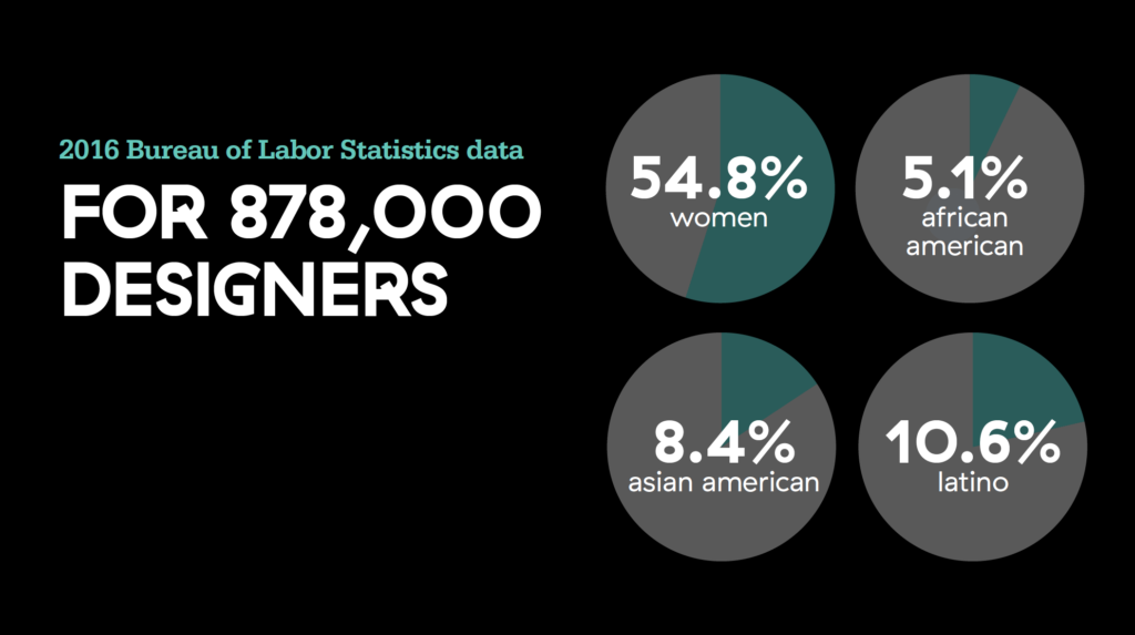
The design field itself is notably lacking in diversity of gender and ethnic representation. The 2016 Bureau of Labor Statistics data show that for 878,000 designers, there were:
- 54.8% women
- 5.1% African-American
- 8.4% Asian-American
- 10.6% Latino3
The designer and social innovator Wendy Brawer noted around this same time that “progress toward equality has stalled. Institutional racism and sexism permeate the design world, diminishing the potential of all.”4
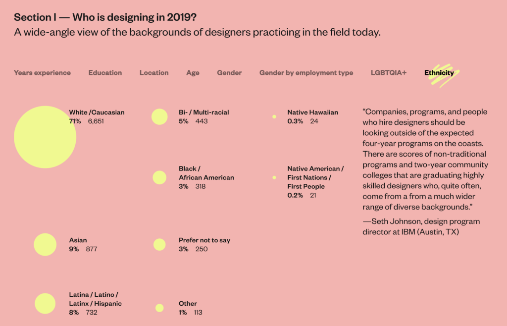
More currently, in the Design Census 20195, out of a total of 9,429 respondents:
- 71% were White
- 9% were Asian
- 8% were Latinx
- 5% were bi-racial
- 3% were Black
- <.3% and .2% were Native Hawaiian and Native American, respectively
So where are the Black designers? Anne H. Berry is a designer and academic. In her essay “The Black designer’s identity”6 she admits not knowing anything about the contributions of Black designers until later in her career. She observes, “A predominantly white profession since its inception, design continues to exist as a space in which European influence remains the primary standard by which ‘good’ design is measured”.
Sylvia Harris, in her seminal 1998 essay, “Searching for a Black Aesthetic in American Graphic Design” writes, “educators (and historians) must teach in a way that addresses the unique cultural experience of all our students.”7 Berry similarly concludes “A full, inclusive design history has yet to become the new standard for design education.” And one of my takeaways? I fear that white designers are designing for a predominantly white audience, perpetuating the cycle of exclusivity.
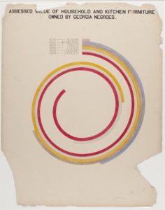
Throughout my 20-year career and education, I also haven’t learned much about designers of color. In researching this paper I made several exciting discoveries. W. E. B. Du Bois – the renowned sociologist, historian, activist, and author — was also a graphic design innovator. As early as 1900 he created infographics (remember, this was decades before the term ‘infographics’ was coined or was even considered a form of design), with his hand-drawn infographics of African-American life8, which “condense an enormous amount of data into a set of aesthetically daring and easily digestible visualisations”.
In my research I also learned of Gail Anderson and her work for the pages of Rolling Stone, specifically a 1990 spread which features her innovative use of hand-drawn type (shown below). “Anderson’s letterforms would go on to influence a generation of designers. Using traditional and non-traditional materials, her typography was an important graphic element across the pages of Rolling Stone magazine for another 12 years.”9
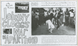
I create hand-drawn type all the time in my graphic recording and illustration work, and need to acknowledge her as an inspiration for these hand-drawn letterforms which I now know is a stylistic innovation that should be attributed to her.
Design thinking through a DEI lens
 Good graphic designers have always employed critical thinking skills. A critical reflection is used not only on the design problem, process and products, but is also cast on ourselves and our role as designers. How can we employ critical thinking skills through the lens of DEI? Innovations in the field of design thinking may yield some answers.
The design thinking process at Stanford d-school asks, “How might we design with intention to eliminate oppression?”10 Since 2016 their framework includes two new modes, Notice and Reflect, which “hold the vulnerability and courage needed to develop one’s self-awareness as an equity-centered designer.”
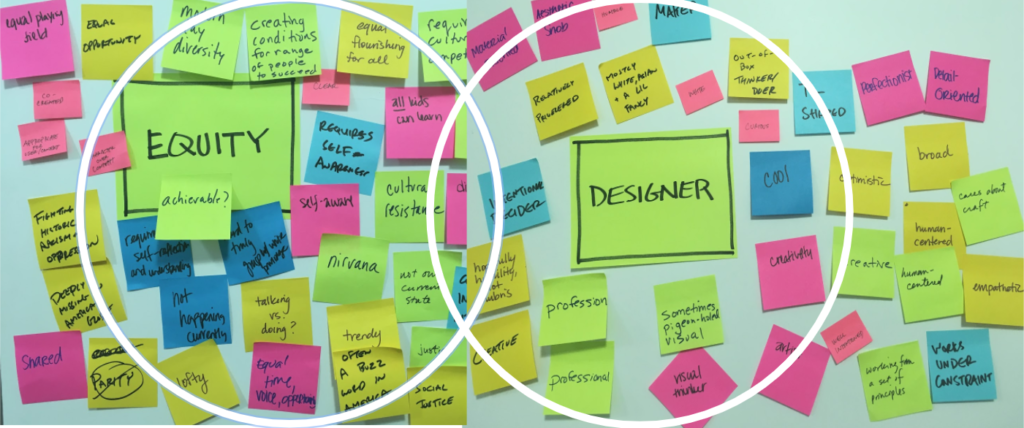
Designing for diversity framework
[illustration by Fanny Luor]
Their “Design for Diversity™(D4D) tool poses 5 core questions to help designers think critically about “who we are, how we create, and who we are creating for”– using the term “design” in its broadest sense to mean anyone involved in the creation of products, services and objects, not just graphic designers. Ideally used with a team, I decided to try a somewhat cursory approach myself using a new logo and web design project I just took on that will focus on providing conversations from health data leaders across the country in the form of podcasts:
Core question #1: What’s the worst-case scenario, and on whom?
Although the client states that the primary user will be health data users across the country, from policy-makers to data analysts, of all ages, it’s possible that older viewers and those from marginalized communities the data has been collected from will not be able to easily access the content, or feel welcome to do so. The best case scenario will be content that invites all populations, races, genders and ages so they can benefit from these resources.
Core question #2: How do the identities within your team influence and impact your design decisions?
The creative team’s priority is to meet the goals of the client, which is to create a well-designed online platform that hosts informal and informative discussions with health data leaders while simultaneously establishing the client, the host of the discussions, as an expert in the field.
When working with others, I value open communication, mutual respect, and doing top-notch creative work with integrity.
Regarding our racial and gender identities, the project team consists of the client, a white male who attended an Ivy-league university; a designer in his 40s who is also a white male; a web developer who is a young male of unknown race and ethnic background; and me, the creative director: a middle-aged, married, childless, white, Jewish female. Because all of us come from relatively privileged backgrounds with access to middle-class and upper middle-class social determinants such as a quality education, safety, housing, healthy fresh food and many other resources, our perspectives and lived experiences may be lacking in representation of diverse audiences that reflect different backgrounds of America’s communities.
Core question #3: Who might you be excluding?
To answer this core question, the authors suggest using the “All People Statement” and from there “you can start to see who you might be excluding, and then you have the opportunity to ask yourself why.”
Starting with the statement of purpose, “We are creating a website that is a gateway to information about the podcast, which features health data leaders having casual conversation about how best to use data and emerging health information technology to improve healthcare delivery”, we next move to “All people will have access to this website, which is a gateway to conversations with health data leaders.” Now I realize that we might unintentionally create an online experience that excludes certain people.
Do we want other people besides health data users to access this site? Possibly. Making a site that feels welcoming in terms of language and imagery should reflect a diversity of viewers. We also want the site to be easily accessible to older users who might experience difficulty using their phones instead of a desktop computer, or inversely, those who only have phones as a means of downloading and consuming online content (and what about those with no access to phones, computers or reliable data delivery – how will these people be reached? I’m afraid like much of the information available in our modern world, the answer is – it will be difficult or impossible for them).
We might also assume the primary user of the site is an older white male – a neutral, authoritative voice that is too often the default – and that exposes a bias, which now enables us to shift our tone, content and design to reach a wider audience, which in turns helps us create higher quality work.
Core question #4: How will you engage the people you want to reach within your design process, equitably?
As mentioned above, I have little insight into the primary demographic for site visitors (what the authors term “The Source”, both the ‘target source’ and ‘excluded source communities’), which are health data users. Certainly, conversations with health data leaders about “how best to use data and emerging health information technology to improve healthcare delivery” impacts all populations, and I want to ensure we do not exclude multiple perspectives. Are there communities that have traditionally been absent from these conversations? Perhaps now is the time to make an authentic effort to discover their concerns.
Core question #5: Is the ongoing process of improving your product/service informed by The Source?
Once the site is live, over time it will be updated with changes. We should put a process in place that continually reflects upon the above questions in order to sustain our equitable approach.
In concluding the guide, the authors are encouraging:
“It’s vital to understand the role our cultural and racial biases play in how we interact with others, how we build our teams, who we view as experts, how we create, and for whom. Yes, this is about building an equitable future for all— and it’s also about opening up pathways to our own creativity by considering nuances, and working with people who can see what we cannot. Whether you’re a solopreneur, a studio artist, a non-profit leader, or a creative technologist, you can use D4D to develop and adopt a diverse, equitable, and inclusive lens to improve the quality of your work and make it culturally adaptable to our world.”
Reflecting Back and Looking Ahead
What I came to discover in my research was that designing with an awareness of DEI lies in applying the critical thinking skills graphic designers have always employed even more broadly to encompass social justice topics. Our success as designers lies in our own professional experiences, and critical analysis is extremely important towards understanding and interpreting these experiences, which can and should include an examination of bias and privilege. “If we as designers are not aware of the biases and baggage we are bringing to every context and relationship we are designing with/in then we run the high risk of reproducing power relationships: admin/teacher, teacher/student/ academics/arts, male/female, white/black/Latinx/Asian/indigenous, new teacher/seasoned teacher.”12
The May 2020 death of George Floyd at the hands of police became the flashpoint for ongoing protests against injustice around the world. These high-profile historic events have left many people pondering how to eliminate systemic racism, not only from policing and law, but in all aspects of modern society. As a creative professional, I need to ask myself: are my actions contributing to racism? What implicit bias do I bring to my work?
I was able to learn of several projects and initiatives that foster DEI principles:
– My journey began with the excellent resources provided by AIGA on their Diversity & Inclusion “learning list”.13
– From my perspective as a designer, having concrete suggestions like the ones provided by The Urban Institute are welcomed and practicable, and I look forward to discovering more content in this vein and encouraging its development.
– Perhaps the most valuable lesson arose out of my application of the Design for Diversity™(D4D)14 framework to a real-life project, which resulted in answering questions that I seem, in hindsight, woefully underprepared to answer. Moving forward I will strive to develop a self-awareness about Diversity, Equity and Inclusion that gets integrated into every creative project conversation.
ENDNOTES
1 “Diversity & Inclusion: learning basics.” Accessed November 4, 2020. https://www.aiga.org/diversity-inclusion-learning-basics
2 Urban Institute, “Applying Racial Equity Awareness in Data Visualization.” Accessed October, 2020. https://medium.com/@urban_institute/applying-racial-equity-awareness-in-data-visualization-bd359bf7a7ff
3 Diversity and Inclusion Impact Overview 2017
4 Kira Gould, “Lessons on Expanding Diversity From the Field of Sustainable Design.” Accessed November 4, 2020. https://www.metropolismag.com/architecture/lessons-expanding-diversity-field-sustainable-design/
5 AIGA, Accurat, and Google Design: Design Census 2019. Accessed November 20, 2020. https://designcensus.org
6 Anne H. Berry, “The Black designer’s identity.” Accessed November 4, 2020. https://recognize.design/The-Black-designer-s-identity
7 Harris, Sylvia. “Searching for a Black Aesthetic in American Graphic Design.” The Education of a Graphic Designer, edited by Steven Heller, pgs. 269–273. 2nd ed. New York: Allworth Press, 2005.
8 The Public Domain Review. “W. E. B. Du Bois’ Hand-Drawn Infographics of African-American Life (1900)”. Accessed November 4, 2020. https://publicdomainreview.org/collection/w-e-b-du-bois-hand-drawn-infographics-of-african-american-life-1900
9 AIGA Eye on Design. Accessed November 4, 2020. https://eyeondesign.aiga.org/sending-off-black-history-month-with-5-designs-from-the-aiga-archives/
10 David Clifford, Stanford d.school & design school X. “Equity-Centered Design Framework” Accessed on November 4, 2020. https://dschool.stanford.edu/resources/equity-centered-design-framework
11 Boyuan Gao and Jahan Mantin of Project Inkblot. “How to begin designing for diversity”. Accessed November 4, 2020. https://thecreativeindependent.com/guides/how-to-begin-designing-for-diversity/
12 David Clifford, Stanford d.school & design school X. “Equity-Centered Design Framework” Accessed on November 4, 2020. https://dschool.stanford.edu/resources/equity-centered-design-framework
13 “Diversity & Inclusion: learning basics.” Accessed November 4, 2020. https://www.aiga.org/diversity-inclusion-learning-basics
14 Boyuan Gao and Jahan Mantin of Project Inkblot. “How to begin designing for diversity”. Accessed November 4, 2020. https://thecreativeindependent.com/guides/how-to-begin-designing-for-diversity/
Want more on Visual Communication and Visual Thinking? Here's some related content for you.
Top Ten Doodles for Visual Communication
Drawing out concepts and ideas instead of writing down words is an effective way to communicate. Doodles are simple shapes and symbols that can be drawn in all kinds of situations. Plus it’s fun, and you don’t need to be an “artist” to do it.