You’ve surely seen them around – perhaps admired them for their tab-free, 3-D coolness factor – and wondered, is a single long page the right approach for my organization’s online presence? Not so fast. Here are 3 myths debunked about single-page scrolling websites:
Myth #1: They’re easier to design, develop and maintain
Properly-designed and developed single-page sites can actually be more difficult to create correctly and more difficult to maintain.
Many of them utilize an elegant, eye-catching technique called Parallax effect, which makes different elements on the page – text, images, videos and other assets – move at different speeds, creating a sort of 3D effect as you scroll down the page. Here’s a stunning example from Alzheimer’s Research, a dementia research charity in the UK. You can bet this is difficult to develop from scratch, as there are many stages of development.
And while the site only has to load once initially, that single page can take a long time because it is so media-rich. This can negatively impact SEO results since users will quickly grow tired of the wait and click elsewhere (likely to your competitors’ sites).
Speaking of search engine issues, there are also problems that arise by only having one URL, one chance to use a keyword, and one H1 heading. There are workarounds, but be prepared to spend more time in the development phase – which brings us right back to Myth #1.
Myth #2: They provide a better user experience
This depends on the type of content on the site. If it’s simpler for the visitor to consume the content by scrolling through it, thereby avoiding the jump from one page to another, then a one-page scrolling site may be a good solution. But if several clicks are necessary to absorb content – for instance, if your site needs to have a lot of categories and sections – then a traditional site will provide an optimal user experience.
Myth #3: They’re just as effective – or more so – at telling a story
When long scrolling sites are used to communicate a single idea, and that message is complemented with visually appealing graphics – such as a non-profit campaign – then yes, they can successfully engage viewers. For this to work, the page must contain less content than a traditional “full” site for an organization, which typically needs more online real estate.
Since there’s only the one page to work with, the inclination to cram too much content into the scrolling site should be resisted. If the site is not kept simple, “eye-tracking research has shown that people can get lost and give up,” warns Tim Halbach, Stone Soup’s Technical Director and owner of InDepth Marketing. To prevent the page from overwhelming the user, choose minimal colors, simple graphic elements, spare text, and a consistent grid layout.
Here are four good reasons and examples to implement a one-page scrolling website:
World Food Clock. When a story can be told in a successive, simple, linear format, such as this numbers-based campaign that illustrates the impact of food production waste.
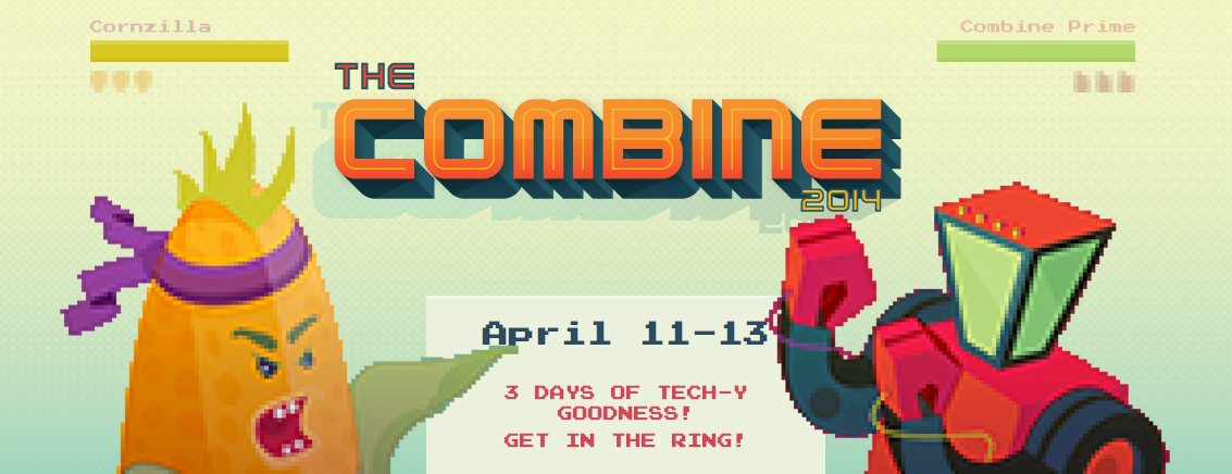
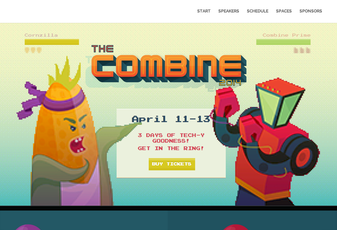
The Combine. When it’s for an ephemeral event that has a specific start and stop date, such as this recent weekend-long conference “to celebrate community, culture, creativity, capital and code” in Bloomington, IN.
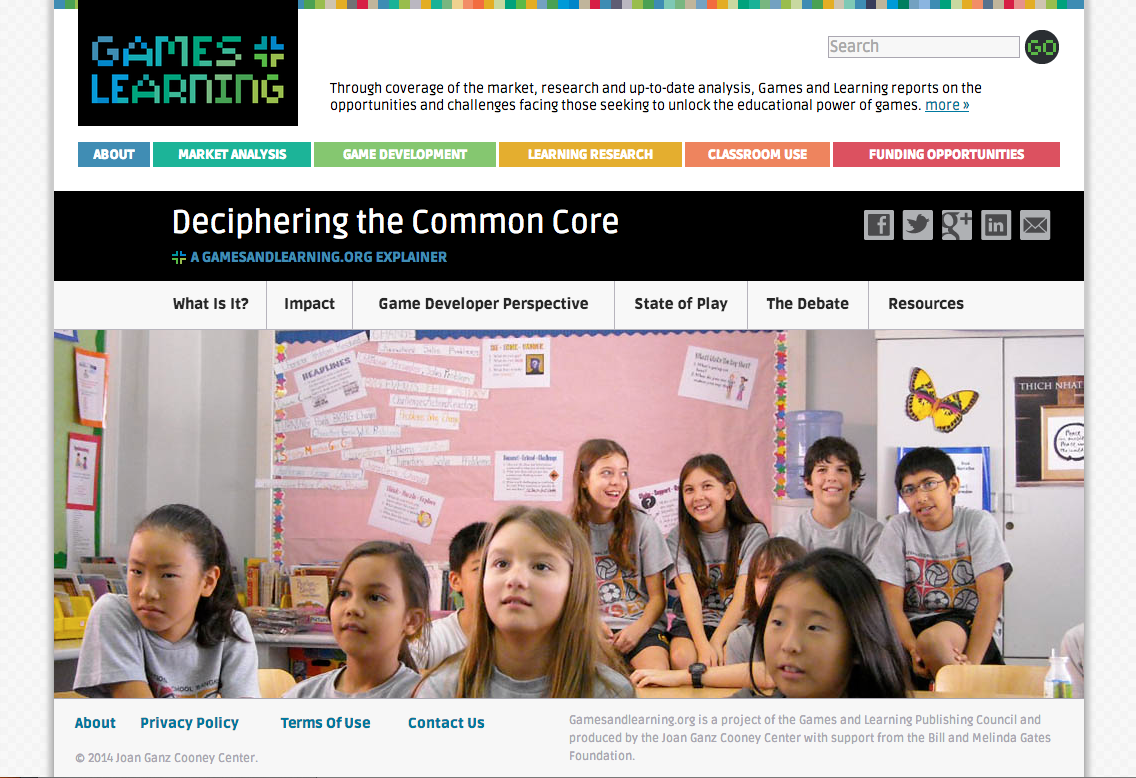
Deciphering Common Core. When it lives within a larger traditional site so that the long page showcases content that is distinct from the rest of a larger, news-oriented site, as it does here at gamesandlearning.org (a site Stone Soup designed for Joan Ganz Cooney Center).
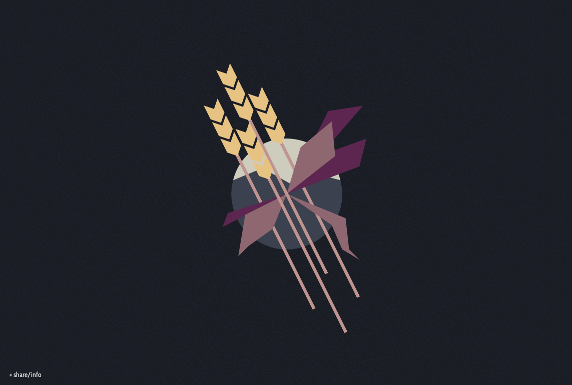
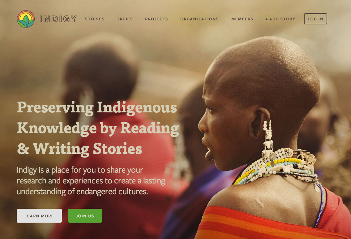
Indigy. When it’s only the landing page that is in scrolling format, as it is here for a global movement to save indigenous tribes.
As you can see, one-page sites can be very effective in certain circumstances, but not so ideal in others. How do you know for sure?
At Stone Soup Creative, we believe every website should begin with your bigger picture. What is your goal? What are your messages? Who is your audience? Dive into these questions; the solution flows from there. The type of site, the information architecture, and the messaging will become clear. If it’s supporting your larger goal in the right way, you can’t go wrong.
If you need help making sure your website supports your organization’s big picture, we’d love to help.
Sources
https://www.creativebloq.com/web-design/parallax-scrolling-1131762
https://www.awwwards.com/seo-optimization-for-parallax-scrolling-websites.html
https://onepagelove.com/
Want more on Visual Communication and Visual Thinking? Here's some related content for you.
Brand Recipe E-Book
Take charge of your brand and achieve your marketing goals!
Stone Soup Creative will help you:
- Take control of your brand
- Stand out more in peoples’ minds
- Gain supporters’ trust (and money)
- Make your marketing efforts more effective